
The Patient Flow Report
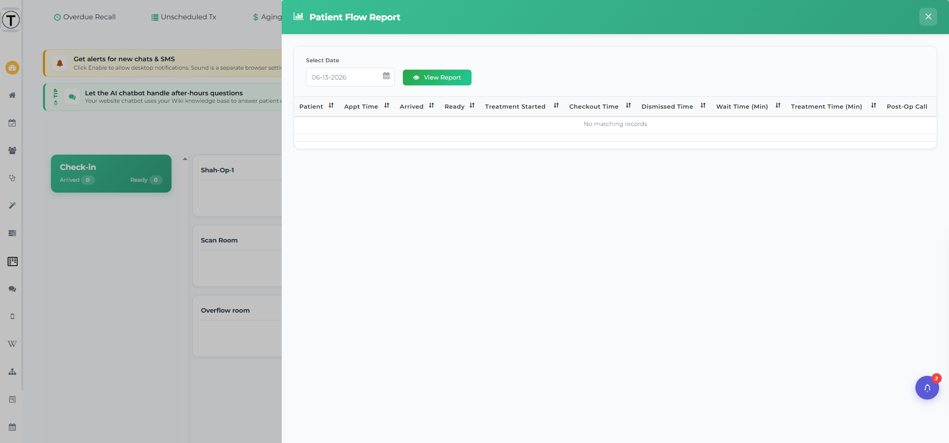
The Patient Flow Report is a per-day table that shows exactly how each patient moved through your office — when they arrived, when they were marked ready, when treatment started, and when they checked out — alongside the wait and treatment times those timestamps add up to. Use it to spot the bottleneck that’s quietly costing you.
Opening the report
Section titled “Opening the report”On the Practice Pulse board, select the bar-chart icon (tooltip View Report) at the top-right of the page title. The Patient Flow Report panel slides out and loads today’s data.
To see another day, pick a date with the Select Date picker and select View Report.
Reading the table
Section titled “Reading the table”Each row is one patient. The columns are:
| Column | What it shows |
|---|---|
| Patient | The patient’s name. |
| Appt Time | The scheduled appointment time. |
| Arrived | When the patient was marked arrived / checked in. |
| Ready | When the patient was marked ready for treatment. |
| Treatment Started | When the patient was seated in an operatory. |
| Checkout Time | When the visit was checked out. |
| Dismissed Time | When the patient was dismissed off the board. |
| Wait Time (min) | Minutes the patient waited before treatment began. |
| Treatment Time (min) | Minutes from treatment start to checkout. |
| Post-op Call | Whether the patient was added to the provider’s follow-up-call list. |
Rows where Wait Time exceeds the threshold you set in Setup are highlighted red, so long waits jump out without scanning every number.
This is a straightforward day-by-day table — there are no charts, no by-operatory roll-ups, and no week-over-week trends.