
Reading a verification
Selecting a row on the dashboard — or View benefits on a patient profile — opens the benefit detail. This is the full answer the carrier gave, laid out top to bottom. Press Esc or select the × to close it.
The Jump to list on the left only shows sections that actually have content, so a short list means the carrier sent less, not that something is broken.
The header
Section titled “The header”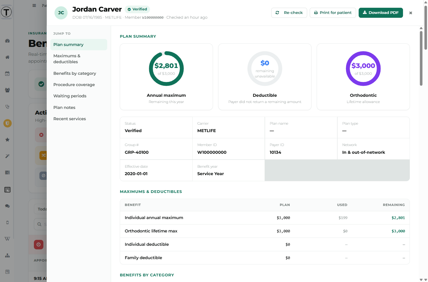
Name, status, and a sub-line reading DOB · Carrier · Member · Checked {when}. On the right:
- Re-check — run the check again (and what that costs)
- Print for patient and Download PDF — only appear on a Verified result. See The patient benefits handout
Plan summary
Section titled “Plan summary”The three rings
Section titled “The three rings”| Ring | Sub-caption |
|---|---|
| Annual maximum | Remaining this year |
| Deductible | Left to meet |
| Orthodontic | Lifetime allowance |
The centre of each ring tells you how much the carrier really said:
- $2,801 of $3,000 — both figures known.
- Unlimited / no annual maximum — the plan has no cap.
- A dollar figure with remaining unavailable under it, and the caption Payer did not return a remaining amount — the carrier gave the plan amount but not the balance. Treat the number as the cap, not as what’s left.
- — / Not available — the carrier sent nothing for this.
The plan facts
Section titled “The plan facts”Status, Carrier, Plan name, Plan type, Group #, Member ID, Payer ID, Network, and where the carrier provided them, Effective date, Benefit year, and Coordination of benefits.
Network reads In-network, Out-of-network, In & out-of-network, or Not applicable.
Dashes are normal. Carriers vary enormously in how much they return, and Teamio prints a dash rather than guessing.
Coverage alerts
Section titled “Coverage alerts”Red and amber warnings worth reading before the patient sits down — a maximum reached or nearly reached, a waiting period that applies, a frequency already used up, or a name-format problem in Open Dental.
Maximums & deductibles
Section titled “Maximums & deductibles”Columns: Benefit · Plan · Used · Remaining, with individual and family rows where the carrier separates them. A Plan cell can read No maximum. Remaining shows a dash when the carrier didn’t say.
Benefits by category
Section titled “Benefits by category”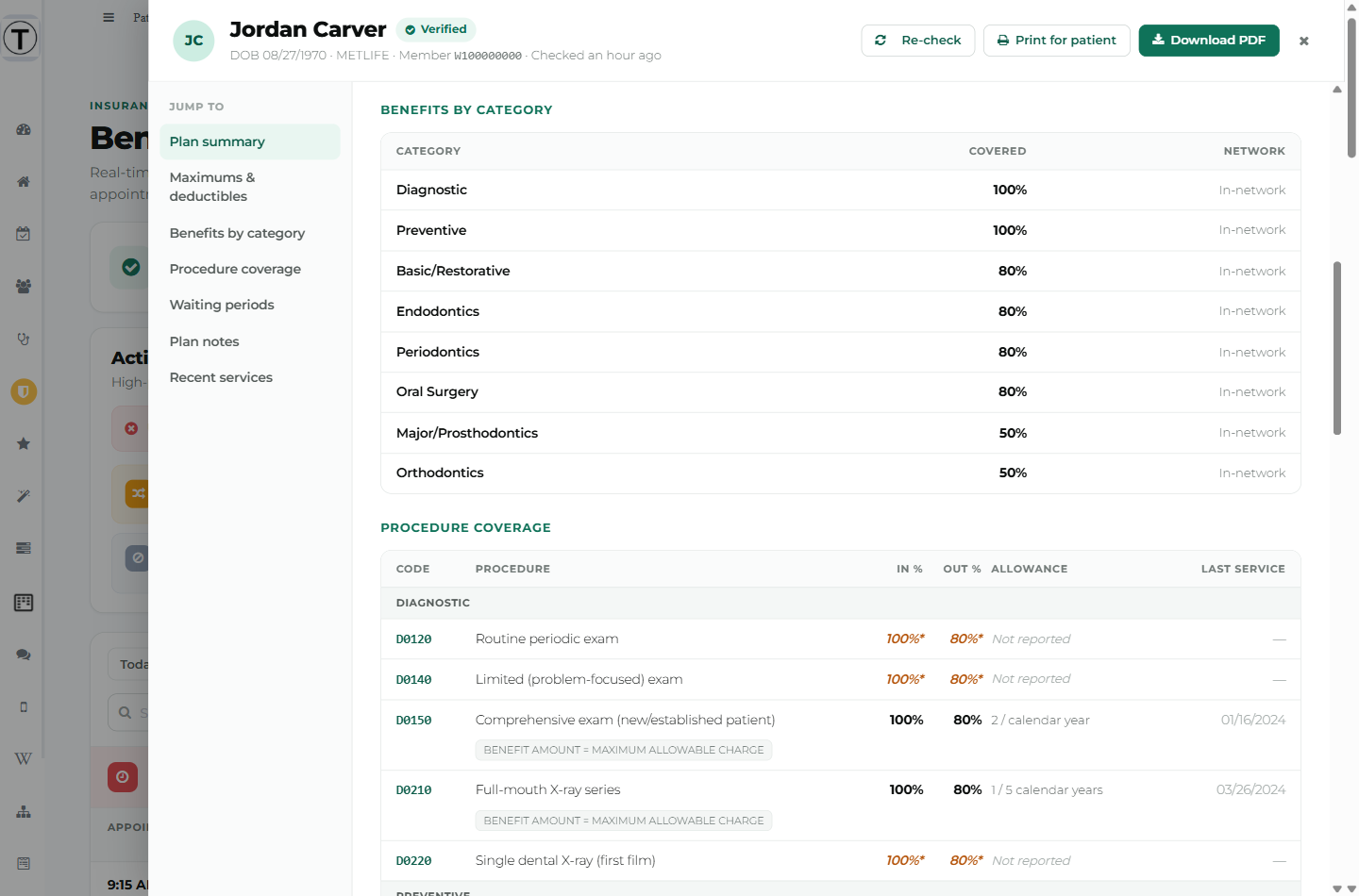
The familiar buckets — Diagnostic, Preventive, Basic/Restorative, Endodontics, Periodontics, Oral Surgery, Major/Prosthodontics, Orthodontics — with Covered percentage and Network.
Procedure coverage
Section titled “Procedure coverage”The most useful table on the page, and the one that prevents denials. Columns: Code · Procedure · In % · Out % · Allowance · Last service.
Rows are grouped by category and show the procedure codes your practice configured in Precheck settings — not everything the carrier volunteered. That’s deliberate: some carriers return hundreds of codes, and a 390-row table helps nobody.
Reading the Allowance column
Section titled “Reading the Allowance column”- 2 / calendar year — the frequency limit.
- 1 of 2 left or 1 left — how much of that allowance remains. It turns red at zero. This is the single most useful number here.
- Not reported — you asked about this code and the carrier didn’t return a limit for it. Hovering says: “This payer did not return a frequency limit for this code. Call the payer to confirm.”
- — — nothing to report.
Percentages with an asterisk
Section titled “Percentages with an asterisk”A percentage shown in amber italics with a * was estimated from the plan’s category coverage, because the carrier didn’t return a benefit specific to that code. The footnote under the table says so:
* Estimated from category coverage; your plan did not return a benefit specific to this code.
Treat those as a good guess, not a quote.
Note chips
Section titled “Note chips”Small chips under a row carry the carrier’s own qualifiers — No deductible, Alternate benefits may apply, Shares frequency: D0120, D0150, or the payer’s verbatim text.
”Also reported by this payer (N)”
Section titled “”Also reported by this payer (N)””A collapsed expander at the bottom. These are codes the carrier returned that aren’t on your configured list. They’re kept, not merged into the main table, so your list stays the list you asked for. Expand it when you need a code you don’t normally verify.
Exam rows
Section titled “Exam rows”Exams appear as a single uncoded Exam row rather than D0120 / D0140 / D0150. Carriers frequently disagree with the chart about which exam code was used — and since those codes carry different frequency allowances, printing the carrier’s guess would point you at the wrong conclusion.
Waiting periods
Section titled “Waiting periods”Four buckets — diagnostic & preventive, basic restorative, major services, orthodontics — each marked Applies (amber) or None (grey).
Plan notes
Section titled “Plan notes”The carrier’s own plan-level free text, verbatim.
Recent services (per insurance)
Section titled “Recent services (per insurance)”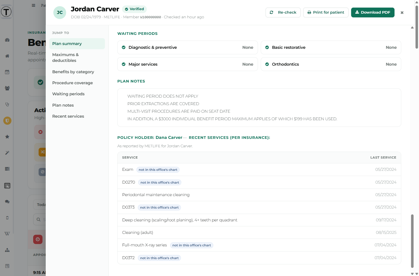
This is the carrier’s record, not your chart — and that’s exactly why it’s valuable. Work done at another practice still counts against a frequency limit, and this is the only place you’ll see it.
- The heading names the policy holder when it’s somebody other than the patient — a parent or spouse. The name renders in colour so you notice.
- A sub-line attributes the data: “As reported by {Carrier} for {Patient}.”
- A row tagged not in this office’s chart is a service the carrier has on record that your completed procedures don’t. Hovering explains: “It was likely done elsewhere and still counts toward the patient’s frequency limit.”
Patients with two plans
Section titled “Patients with two plans”When a patient carries a secondary plan, Primary and Secondary tabs appear under the header, each labelled with its carrier. Every section below re-renders for the plan you’ve selected, and Re-check this plan only runs a single billed check for that plan.
A secondary that’s never been checked shows its own Not verified yet state.
When there’s nothing to show
Section titled “When there’s nothing to show”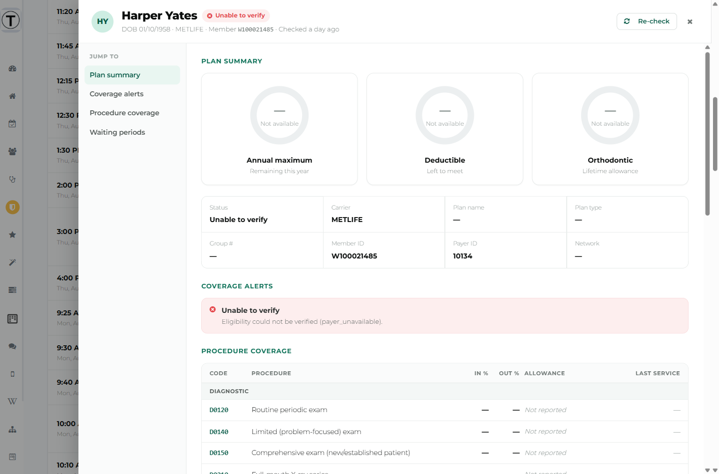
- Not verified yet — never checked. A green Verify now button runs the first check.
- Can’t be verified electronically — “This plan has to be verified by phone. Checking again won’t help — the payer doesn’t offer electronic eligibility at all.” There’s deliberately no button here; another check would only refuse again.
- Unable to verify / Error — the check reached the carrier but didn’t produce benefits. Coverage alerts names the reason. See What each status and message means.