
Configuring a control
Every control you add has a Control Configuration panel. Hover the control in the builder and select the blue gear (tooltip Control Configuration; the toolbar also has the yellow Re-position / Drag handle and the red Delete Control trash). The panel slides in from the right. The settings here apply to all control types; the type-specific extras are in the controls reference.
Basic Details
Section titled “Basic Details”- Unique ID — an auto-generated identifier (read-only). You won’t normally touch it.
- Name (Must be unique) — the field’s key, unique within the form. This is what answers are stored under and what conditional logic and Open Dental mapping reference. Think
first_name, not “First name”. - Label — what the patient reads above the field.
- Sub-label — optional smaller hint text under the label.
- Show Label? — turn the visible label off (e.g. when the purpose is obvious from context).
- Field Placeholder (Optional) — grey example text inside an empty input (“e.g. Jane”).
- Default Value (Optional) — a value the field starts with.
- Save to Open Dental Field (Optional) — map this control to an Open Dental chart field so the patient’s answer writes back to the chart on submit. The default option is — Select Field — (no mapping; the answer stays in Teamio only). See Forms and Open Dental for the full field list. For Diseases, Allergies, Medications, and Referrals, only one field per form can be mapped to each one — see One field per form for each Open Dental list.
On OTHER-type forms, input controls also offer two pre-fill options:
- Pre-fill Patient Name — fills the field with the patient’s name (Last, First), read-only.
- Pre-fill with Teeth #‘s — fills with tooth numbers from the patient’s next scheduled appointment.
Enabling either one disables the other and disables the Field Placeholder (you’ll see Placeholder is disabled when a pre-fill option is enabled).
Styling / Classes
Section titled “Styling / Classes”- Container Size Class — the column width on a 12-column grid, listed as e.g. COL4 (col-md-4 md-layout-item md-size-33) through COL12 (col-md-12 md-layout-item md-size-100). New controls default to COL4 (one-third). Two
COL6controls sit side by side; threeCOL4fit in a row. For a worked example, see Increasing size of Consent Signature box. - Container / Field / Label Additional Classes — optional custom CSS classes for fine styling. Most offices never need these.
Highlight for Alert
Section titled “Highlight for Alert”A red card with a checkbox. When on, this control is highlighted in red in the submission view and the PDF, drawing a reviewer’s eye to safety-critical answers (allergies, blood thinners). For choice controls, you can instead flag individual options — but those per-option checkboxes only become editable after Highlight for Alert is checked. See Per-option alert flags.
On an Open Dental Data Field set to Diseases, Allergies, or Medications, selecting None never triggers the highlight — only an actual allergy/disease/medication does. By default that means any selection other than None. Referrals has no None option, so with Highlight for Alert on, any pick triggers it. To narrow the highlight to specific options (any data type), expand Control Specific Configuration below and pick them in the “Highlight only when the patient selects any of:” picker; leave it empty for the default “anything other than None” (or, for Referrals, “any pick”) behavior.
Control Specific Configuration
Section titled “Control Specific Configuration”The settings unique to this control type (an Input’s text/password/hidden mode, a Date Picker’s format, a Dropdown’s option list, etc.). Documented per-control in the controls reference.
Validation Rules
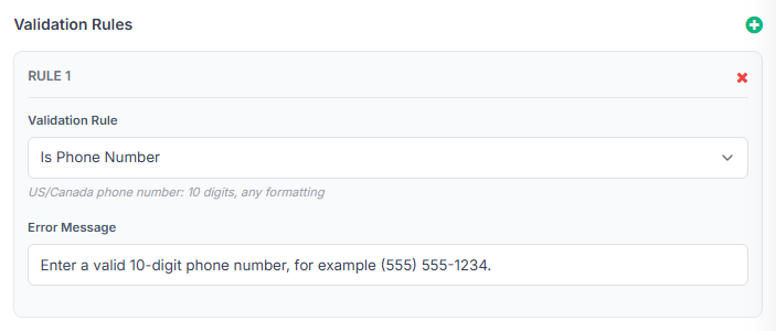
Section titled “Validation Rules”Select the + to add a rule. Each row shows Rule N, a Choose a Rule dropdown (with a short description per rule), an optional Rule Value, and an editable Error Message (pre-filled with a sensible default). Remove a rule with its X.
| Rule | What it checks | Needs a value? |
|---|---|---|
| Required | The field must be filled in | no |
| Minimum | Minimum number (for Number) or minimum length (for text) | yes |
| Maximum | Maximum number or length | yes |
| Is Email | A valid email format | no |
| Is Phone Number | A valid 10-digit US/Canada phone number | no |
| Is Social Security Number | A valid 9-digit Social Security Number | no |
| Regex | Matches a custom pattern | yes (the pattern) |
| Same As | Matches another field’s value (e.g. “confirm email”) | yes (the other field’s Name) |
| Custom Closure | Advanced/developer-only custom check | — (ignore this one) |
File Uploader and Attachment controls only offer three rules: Required, Minimum, and Maximum. On these controls, Required means the patient must upload at least one file before they can submit — handy for things like a photo ID that shouldn’t be optional. Minimum and Maximum cap the number of files, not a length. If a patient tries to submit without meeting the rule, the upload area outlines in red and the error message appears underneath it.
Required vs optional: a field is optional until you add the Required rule. (For choice controls, “required” means at least one option is selected.) A required field also shows a red asterisk next to its label on the patient’s form, so patients can see at a glance what’s mandatory. Controls mapped to First Name, Last Name, or Birth Date get Required added automatically on save.
Format rules don’t make a field required
Section titled “Format rules don’t make a field required”Is Email, Is Phone Number, and Is Social Security Number only check the shape of an answer — they all pass when the patient leaves the field blank. If the field must be filled in, add Required as a second rule alongside the format rule. This is also why an optional email field can now be submitted empty even with Is Email on it.
What the patient sees when a rule fails
Section titled “What the patient sees when a rule fails”If a patient tries to submit with an answer that fails a rule, the field outlines in red with the rule’s error message underneath it, and the page scrolls to the first problem field. A toast also appears: Please check this field: (one problem) or Please check the highlighted fields: (more than one), followed by one line per field naming it and its message — for example:
Please check the highlighted fields: • Cell Phone — Enter a valid 10-digit phone number, for example (555) 555-1234.
On a Spanish-language form, both the toast heading and the field messages show in Spanish.
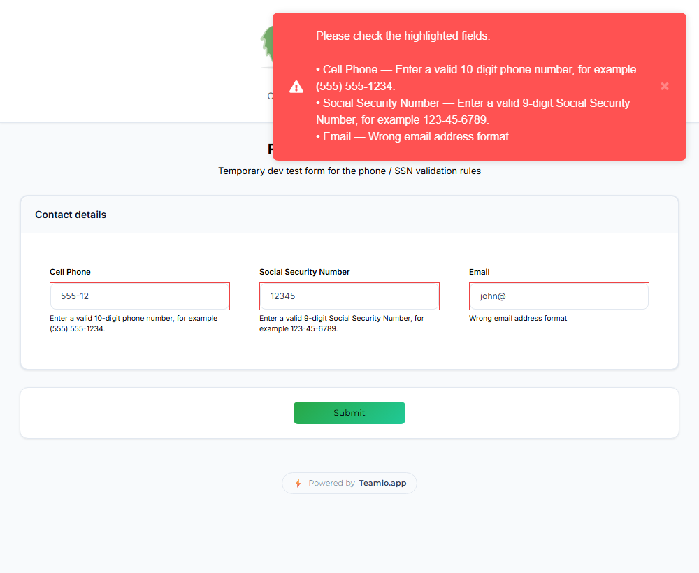
Phone and Social Security Number fields
Section titled “Phone and Social Security Number fields”Add Is Phone Number to accept any 10-digit US/Canada number regardless of formatting — 5555551234, (555) 555-1234, 555.555.1234, or +1 555 555 1234 all pass; extensions, too few or too many digits, and non-numeric text don’t. Add Is Social Security Number to accept 9 digits with or without dashes/spaces, while rejecting known-invalid numbers and text like “none”. If a form only asks for the last four digits of an SSN, don’t add this rule — a partial number will never pass it.
A couple of things happen automatically once one of these rules is on a control:
- When the patient leaves the field with a valid value, it’s neatly reformatted — to
(555) 555-1234or123-45-6789— so they can see it was understood. An invalid value is left exactly as typed so they can find their mistake next to the error message. - On a phone, the field brings up the phone keypad for Is Phone Number and the number keypad for Is Social Security Number; an SSN field is also never offered for browser autofill.
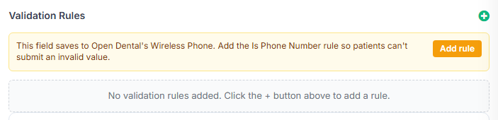
The Open Dental hint. If a control’s Save to Open Dental Field is Home Phone, Work Phone, Wireless Phone, or Social Security Number and it doesn’t yet carry the matching rule, the Validation Rules panel shows an amber tip — for example, “This field saves to Open Dental’s Wireless Phone. Add the Is Phone Number rule so patients can’t submit an invalid value.” — with an Add rule button. Nothing is added for you; select Add rule, then Save or Save & Close as usual.
Visibility / Conditional Logic
Section titled “Visibility / Conditional Logic”Rules that control when this field is shown. The container has a Visual / JSON toggle — build conditions visually, or edit the raw JSON for advanced cases.
- Joiner —
AND(all conditions must be true) orOR(any). - Add Condition — adds a row: a field (picked from a section-grouped dropdown of the form’s other fields), an operator, and a value. Remove a row with its Remove button.
- Operators — equals, not equals, in, not in,
<,<=,>,>=.
Example: show a “Which medications?” text field only when the “Do you take medications?” switch is on. The field stays hidden — and isn’t required — until the condition is met.
Any control (or section) with visibility rules shows a Conditional eye badge in the builder, with a tooltip describing the conditions.
Per-language label overrides
Section titled “Per-language label overrides”When the form has extra languages enabled, Basic Details gains per-language Label and Placeholder fields so you can hand-tune the translation of an individual control. See Multi-language forms.
Section configuration
Section titled “Section configuration”Sections have their own Configuration sidebar too (opened from the section’s Configuration button): Headline, Sub-Headline (with per-language variants), CSS classes, Show Section Headline?, and section-level Visibility / Conditional Logic — so a whole group of fields appears only when relevant.
Saving
Section titled “Saving”The panel changes apply to the live preview immediately, but nothing is final until you select Save Form (new form) or Save Changes (existing form) at the top of the builder.
Related
Section titled “Related”- Form controls reference — the per-control specific settings
- Creating a form — sections and the builder