
Production trends
The Huddle tells you about today. Production Trends tells you about the shape of the last week, month, or year — so a slow stretch reads as a dip on a chart instead of a month-end surprise.
Where: Sidebar > Today’s Huddle (/app/huddle) > Production Trends in the page header.
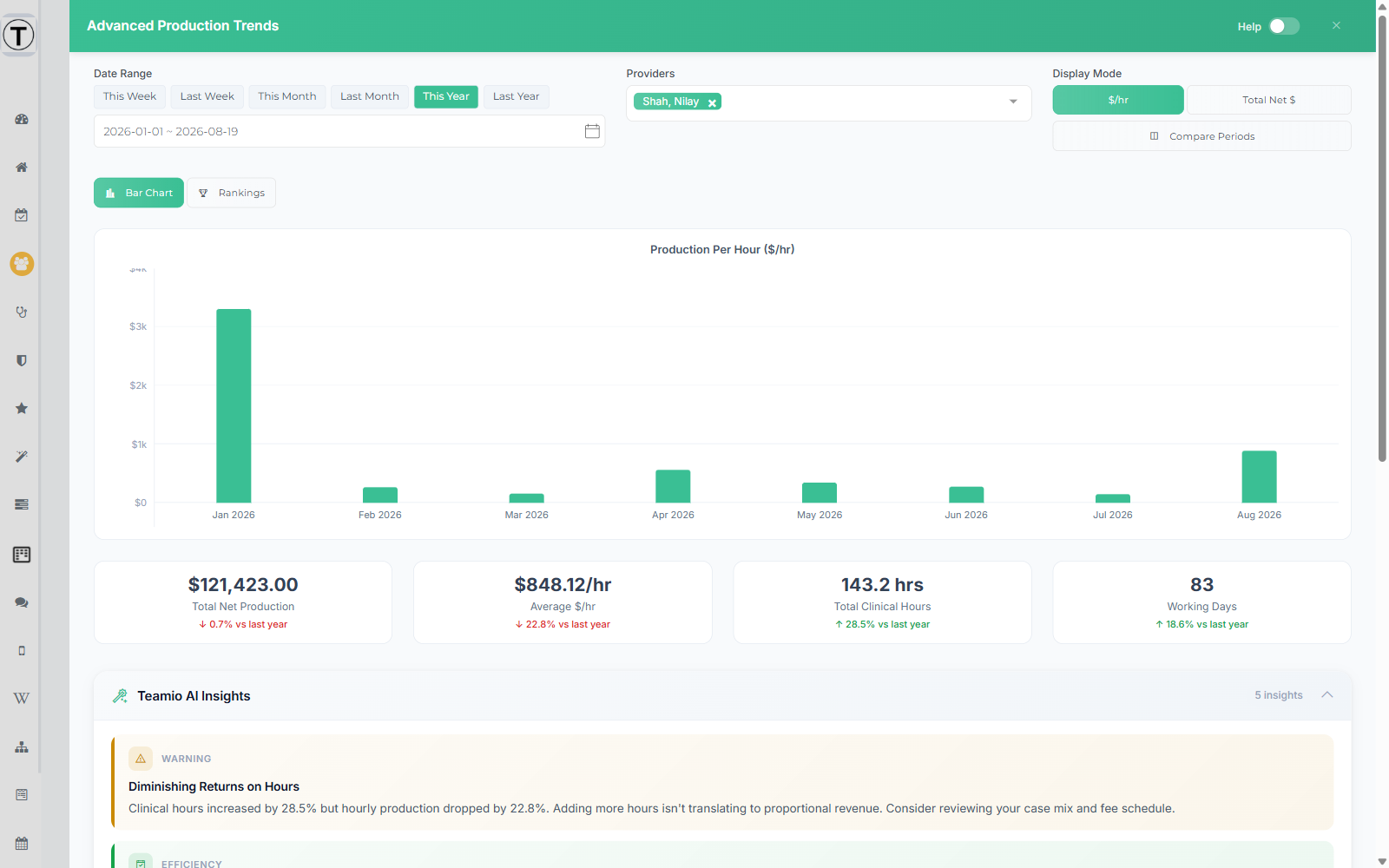
The button opens a full-width slide-out titled Advanced Production Trends. Close it with the X; the Help toggle in its header opens a built-in guide to the metrics.
Setting up the view
Section titled “Setting up the view”Three controls run across the top:
- Date Range — presets for This Week, Last Week, This Month, Last Month, This Year, and Last Year, plus a custom date-range picker.
- Providers — a multiselect to focus on one provider or a few. Each selection appears as a removable chip.
- Display Mode — $/hr or Total Net $. This switches what every chart and ranking below is measured in.
Underneath, Bar Chart and Rankings switch between the two views.
The summary tiles
Section titled “The summary tiles”Below the chart sit four tiles, each with a comparison against the equivalent previous period:
- Total Net Production
- Average $/hr
- Total Clinical Hours
- Working Days
The green and red deltas are the useful part — they tell you whether a bigger number came from working better or just from working more days.
Provider Rankings
Section titled “Provider Rankings”The Rankings view ranks your providers against each other and against a Practice Average line, on whichever of three measures you pick: $/hr, Net Production, or Clinical Hours.
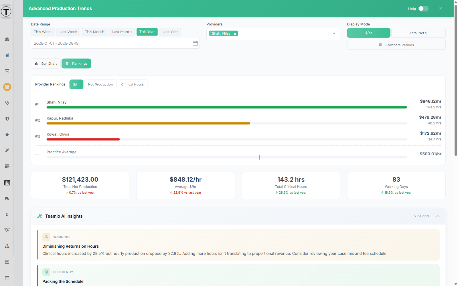
Ranking by $/hr rather than raw production is what makes this fair to a part-time associate — see $/HR for exactly how the hourly figure is built, including the effect of the lunch durations you set in provider goals.
Compare Periods
Section titled “Compare Periods”Select Compare Periods to put two windows side by side. Pick Period A and Period B by hand, or use the presets — This Month vs Last Month, This Week vs Last Week, This Year vs Last Year. Exit Compare returns to the single-period view.
Teamio AI Insights
Section titled “Teamio AI Insights”At the bottom of the panel, Teamio reads the same numbers and writes up what stands out — flagged as efficiency observations or warnings. For example, it will call out clinical hours rising while hourly production falls, which is the kind of pattern that’s easy to miss when you’re only watching the production total.
Treat these as prompts for a conversation, not conclusions. They describe what the numbers did, not why.